Simple tricks to transition from height 0 to 100% CSS only.
Updated at: 10 May 2023Deepak Painkra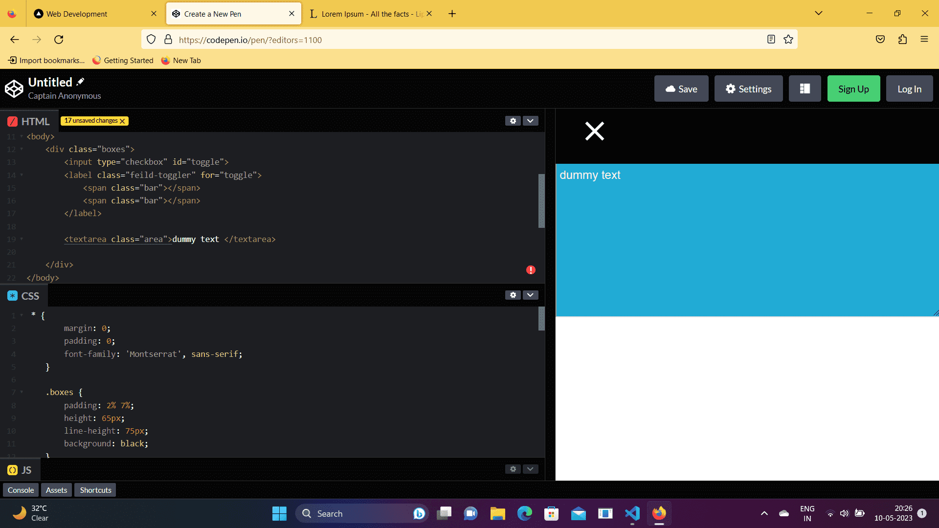
In this tutorial, I will share a simple trick to transition from height 0 to 100% CSS only, so let's get started.
First, let's add padding, border and margin to zero.
.bar:nth-child(1) {
  margin-top: 3.55vh;
  position: absolute;
  transform: rotate(90deg);
}

.bar:nth-child(2) {
  margin-top: 3.55vh;
  position: absolute;
}
also we have written styles for div
After that, I created a div to toggle the text area, and also you can use the same class name to toggle the text area, which will also work.
<div class="boxes">
  <input type="checkbox" id="toggle">
   <label class="feild-toggler" for="toggle">
   <span class="bar"></span>
   <span class="bar"><span>
   </label>
<textarea class="area">Dummy text<textarea></div>
First, create an input field with a type check box, which will check whether the button is clicked or not clicked since we are not using Java Script to toggle.
Now next steps, let's create a bar inside a label with a span tag and the class name bar,
<label class="feild-toggler" for="toggle">
  <span class="bar"></span>
 <span class="bar"></span>
</label>
Adding these CSS properties to create a plus icon, I have rotated the first child to 90 degrees to ensure it looks like the plus icon.
.bar:nth-child(1) {
  margin-top: 3.55vh;
  position: absolute;
  transform: rotate(90deg);
}

.bar:nth-child(2) {
  margin-top: 3.55vh;
  position: absolute;
}
After that, let's move on to the next step, create a text area with the class name area, and ensure that you must creates this text area inside the parent div. Otherwise, it won't toggle.
Adding these CSS properties to design the text area,
.area {
  display: grid;
  padding: 20px 0px 0px 5px;
  margin: auto;
  font-size: 1.2rem;
  height: 40vh;
  color: #f1f1f1;
  position: absolute;
  background: rgb(33, 171, 213);
  width: 100%;
  top: 75px;
  left: 0;
  transform: translateY(-100%);
  z-index: -1;
  transition: .6s;
}
now next steps, we go to the hide check boxes so we add display none to the input
.bar:nth-child(1) {
  margin-top: 3.55vh;
  position: absolute;
  transform: rotate(90deg);
}

.bar:nth-child(2) {
  margin-top: 3.55vh;
  position: absolute;
}
and also give some margin to the field toggler class name, and let's add some CSS properties to the first child to rotate 45 degrees
input:checked~.feild-toggler {
  margin-top: 5px;
}

input:checked~.feild-toggler .bar:nth-child(1) {
  transform: rotate(45deg);
}
We will also add in the second child.
input:checked~.feild-toggler .bar:nth-child(2) {
  transform: rotate(-45deg);
}